Data visualization is an important component to multimedia journalism that helps journalists to organize their information and readers to understand dense data. Making number heavy information concise with data visualization is important so that the public can draw the necessary conclusions about their environment and society. With this being said, data visualization in storytelling simply helps a journalist to fulfill one of their roles in democracy—to provide people with the information they need to be free and self-governing. This article will analyze three news worthy stories that use data visualization to help convey their messages.
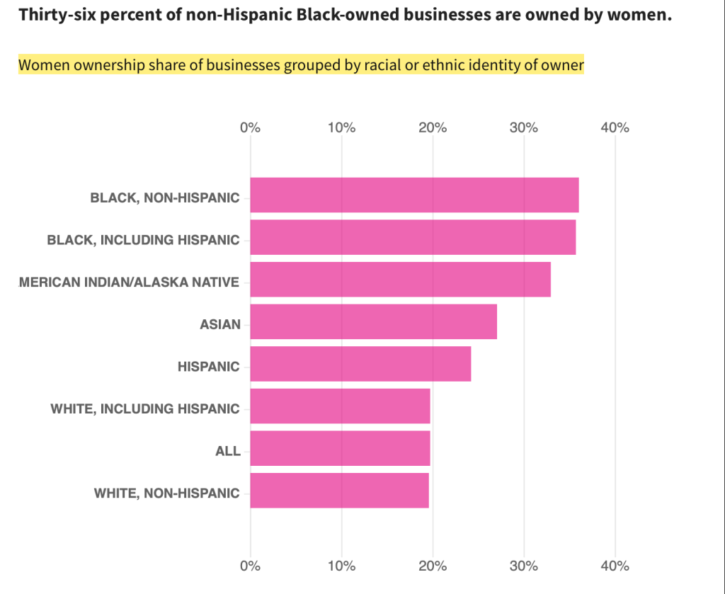
“A higher share of Black-owned businesses are women-owned than non-Black businesses,” is a story done by USA Facts highlighting data from the Us Census Bureau. This news story emphasizes the fact that across all racial demographics, Black women have the highest percentage of business ownership compared with men in their racial category. To help the audience understand this information and further emphasize it in the news article, the writers incorporated the bar graph shown below. The bar graph shows women ownership share of businesses grouped by the racial identity of the owner while listing different types of demographics and the percentages for each. The information is presented well and is easy to follow since the demographics on the side are organized from the highest percentage of women ownership to the lowest. With Black women being at the top of the bar graph, readers can distinctly see that they out preform all racial demographics when it comes to ownership of businesses compared to the men in their racial category.
“Data storytelling- Black Lives Matter” is a news story down by Oluwatosin Sanni, a writer for medium.com. Sanni uses data visualization to answers the following questions surrounding the Black Lives Matter Movement:
- Which day, month and year death is highly recorded?
- What is the percentage of age (group) and gender affected?
- What race, state, city and demographic are most affected?
- What is the proportion of flight or fight when in threat to the police?
- What are the most used arms?
- Black lives Matter, further insight on black race
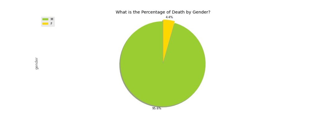
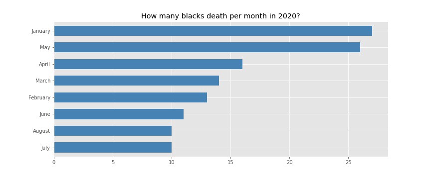
Using data visualization, the writer was able to effectively help the readers draw their own conclusions about the data. For instance in the “gender analysis” pie chart shown below, the writer shows how Black men were the victims of 95.6% of the deaths at the hands police officers, while 4.6% of Black women were the victims. The writer is also able to demonstrate how in May 2020 there was a surge in police violence which resulted in the death of Black citizens. The below visual shows the total number of Black people killed by police each month. Like the writers of “A higher share of Black-owned businesses are women-owned than non-Black businesses” did, Sanni organizes this data in a bar graph with the month with the highest amount of killings first. As a journalist, this chart makes me want to investigate why there was a surge in Black deaths at the hands of police officers in May 2020; and speculate that it could’ve been due to the riots and protests that occurred that month after the death of George Floyd. It also helps one to conceptualize the Black Lives Matter Movement and draw conclusions from the information that could help push the movement’s agenda.
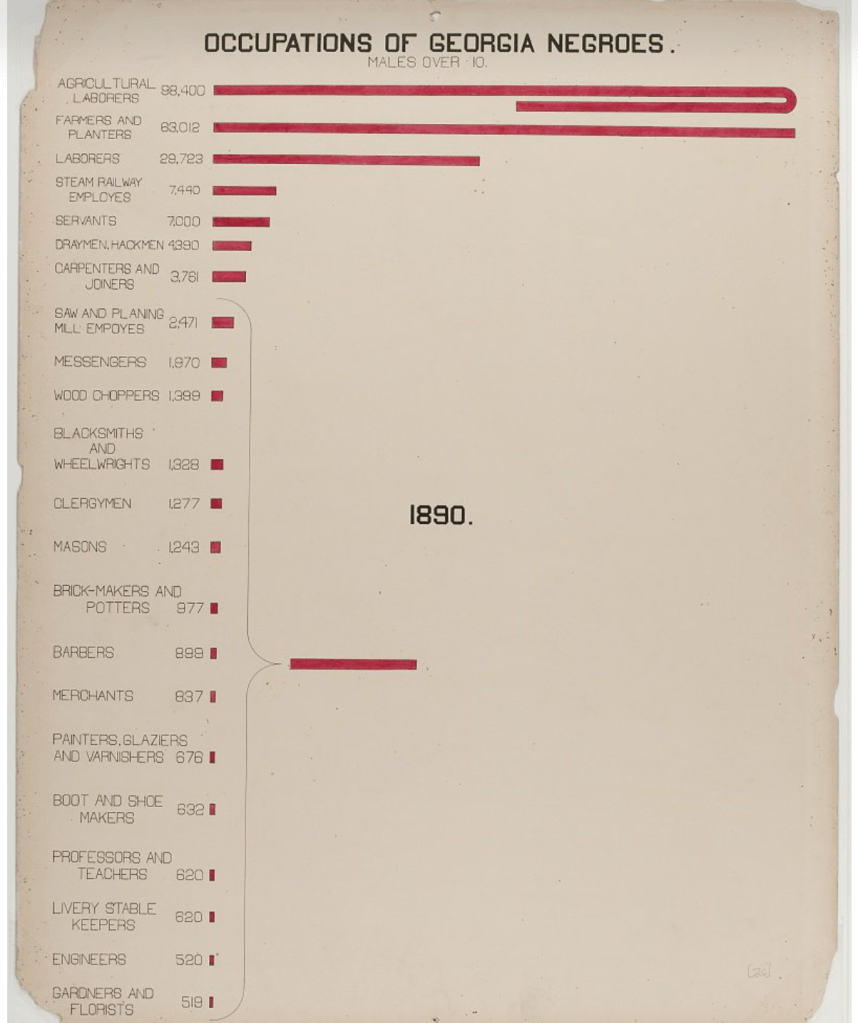
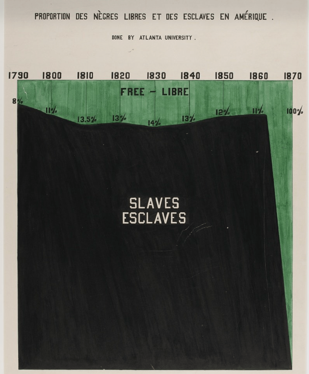
“W.E.B. Du Bois’ hand-drawn charts from 1900 show the story of Black Americans through data,” is a story done by USA Facts, showcasing a series of hand drawn charts and maps from the 1900 Paris Exposition. The point of incorporating the various data visualization elements is to first cite Du Bois’ works as an early example of how data visualization progressed the Black community during the time, and to also help readers to use the data to draw their own conclusions about issues involving demographics. For example, in the area chart displayed below entitled “Proportion of Freemen and Slaves Among American Negroes,” one can distinctly see how enslaved Black people greatly out numbered liberated Black people from 1790-1870. Another data visualization tool used in the article is a bar graph demonstrating the occupation that Black people from Georgia held during the late 1700s-1800s. It is evident by merely glancing at the chart that Black people mainly worked as agriculture laborers, farmers and planners, and steam railway employees (in that order) during that time. These two data charts alone demonstrates the significance of data visualization when trying to draw conclusions about race, wealth and class. The way it is organized and colored coded is easy to understand so that one could go back and look at these primary documents to make conclusions about the Black population before Reconstruction.