This past holiday season I temporarily deleted my Instagram and Twitter from my phone, spent two months in my childhood home with my family and just appreciated being able to wake up with no pressing obligations. Life has been moving overwhelmingly fast lately and I needed that time to stop, breathe, appreciate what I have right in front of me—and most importantly, slow down.
As I’ve been practicing daily mindfulness, I’ve realized that there are simple ways I can slow down my life in a world that seems so fast paced. Some techniques that I’ve learned includes: journaling, praying and meditating, listening to music, making ample time for talking to loved ones and spending time in nature.
As I was going through my school week, which includes my daily 20 minute walk to Howard’s campus, I forced myself to slow down and reflect on what I was seeing. In doing so, I was mindful of the composition techniques I’ve recently learned and began to take photos of what seemed visually captivating. In this way I was again, able to slow down and produce a collection of over 20 resonating photos. Here are just 10 of the photos from the collection with their respective composition technique.
Side Note: For those who may not know, ‘composition,’ in photography refers to how the various elements in a scene are arranged within the frame.
1. Rule of Thirds

I am such a foodie. Whenever I encounter a plate of food at a restaurant that I can tell was made not only for taste, but to aesthetically please the consumer I have to take a picture! This plate of hummus was not only tasty, but beautiful to look at. This image abides by the rule of thirds. If you were to split this photo into threes, or even nine rectangles, it would be evident that the hummus is the most important element.
We have a natural tendency to want to place the main subject in the middle, and whether it was consciously or unconsciously, the chefs were abiding to the rule of thirds.
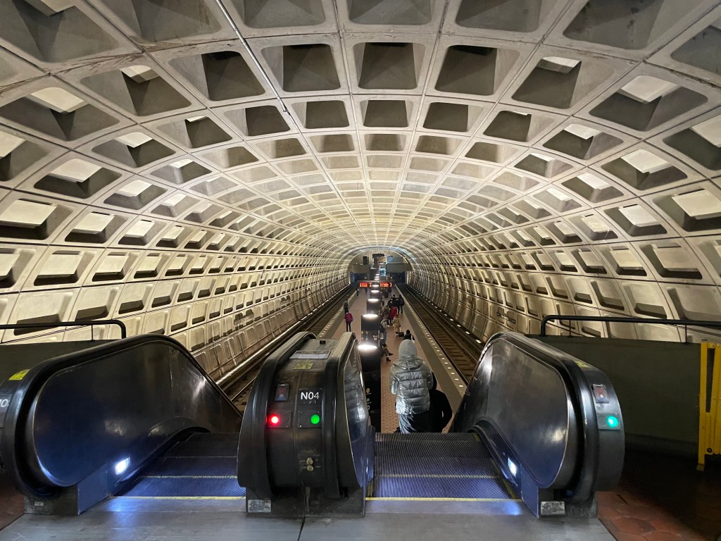
2. Centered Composition and Symmetry
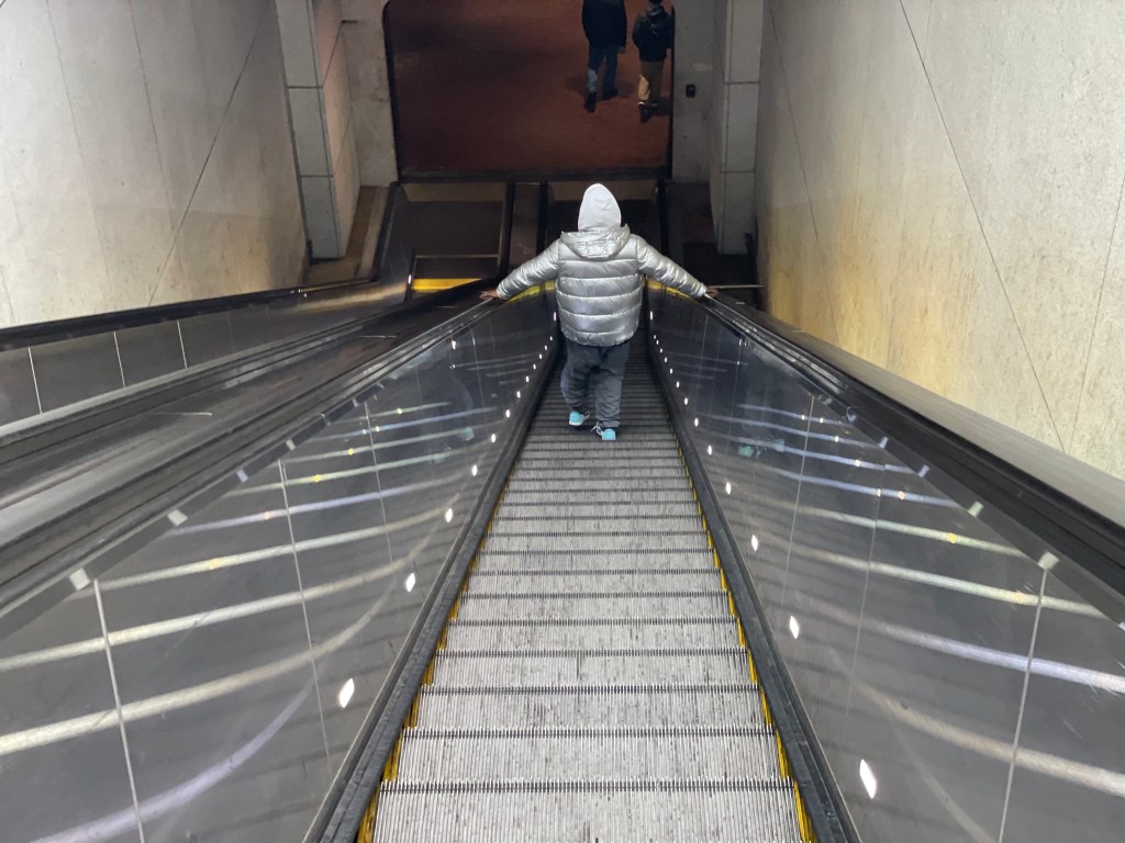
During my walk home form class, I decided to capture this photo as I was making my way down to the metro station near campus. The way the subject in the silver coat is standing directly at the center of the escalator with both hands on either side perfectly compliments my depiction of centered composition and symmetry.
Symmetrical scenes are perfect for a centered composition. This photo is already very symmetrical because of the downward perspective of the escalator, but the subject in the middle greatly emphasizes it.
3. Diagonals and Triangles
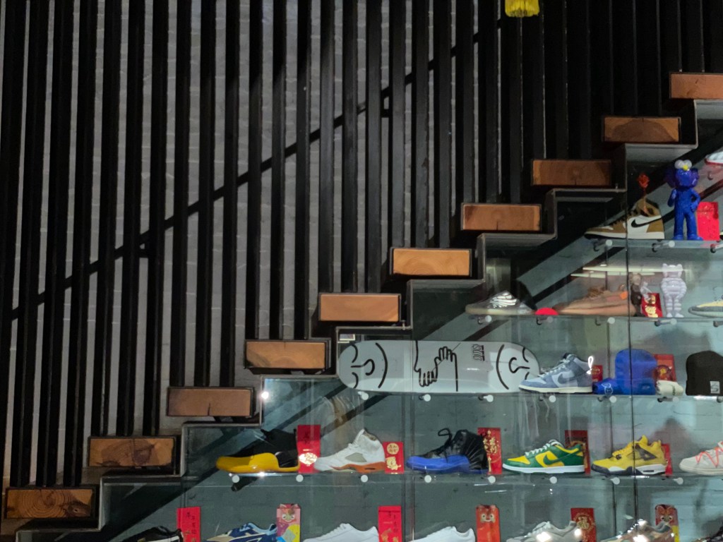
Many photographers use diagonals and triangles to add “dynamic tension” to a photo. While eating at Maketto, a local restaurant on H Street in D.C., I noticed the triangles and diagonal being made with the decorative shoe wall. The shoes are stacked in a pyramid formation and some of the shoes themselves have a triangular outline. With that being said, this was the perfect scene to demonstrate diagonals and triangles within a composition.
4. Patterns and Textures
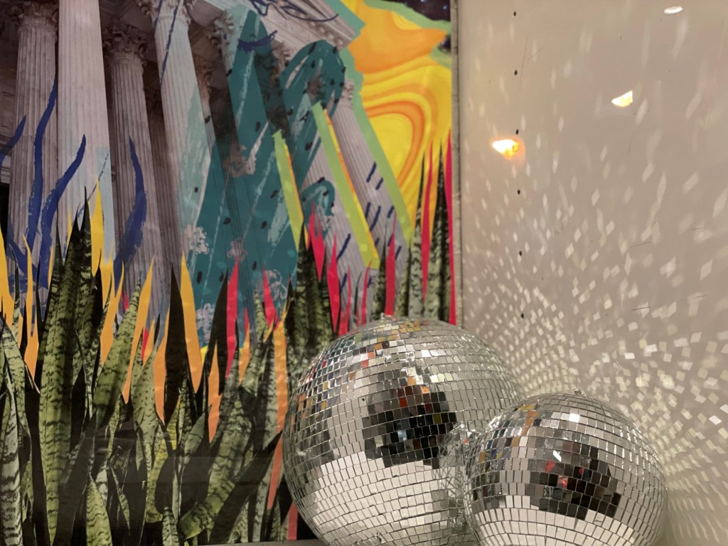
This photo was one of my favorites in the collection because of the varied patterns and textures I was able to include in one shot. From the disco balls, to the abstract art that isn’t confined to one particular pattern, it’s safe to say that this shot has a lot going on. But as humans, we are naturally attracted to patterns— they intrigue use. Intrigue is exactly what I felt when I noticed this wall of patterns and textures at Maketto. It doesn’t make sense, but that’s what makes it so interesting.
5. Rule of Odds
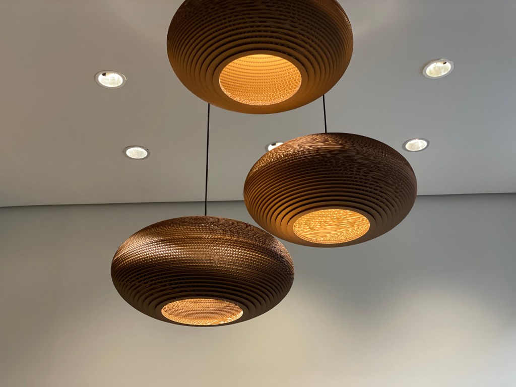
In photography the rule of odds suggests that an image is more visually appealing if there are an odd number of subjects. In this case, there are three lamps and the odd number makes the image easier on the eyes and more pleasing to look at.
6. Fill the Frame
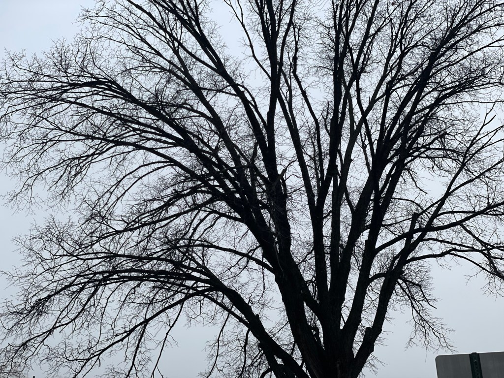
As I was being intentional about slowing down during my walks to campus this past week, I reflected on how bare the trees were and how they looked almost skeleton-like when I looked up at them. That thought is what inspired to capture this upward shot of this huge, leafless tree.
By filling the frame with the subject (the tree) and leaving no space around it, it helps my audience focus directly on the tree without any distractions. This way, the audience is able to explore every detail of the subject—which in this case eI’m trying to emphasize how bare and almost lifeless the trees look.
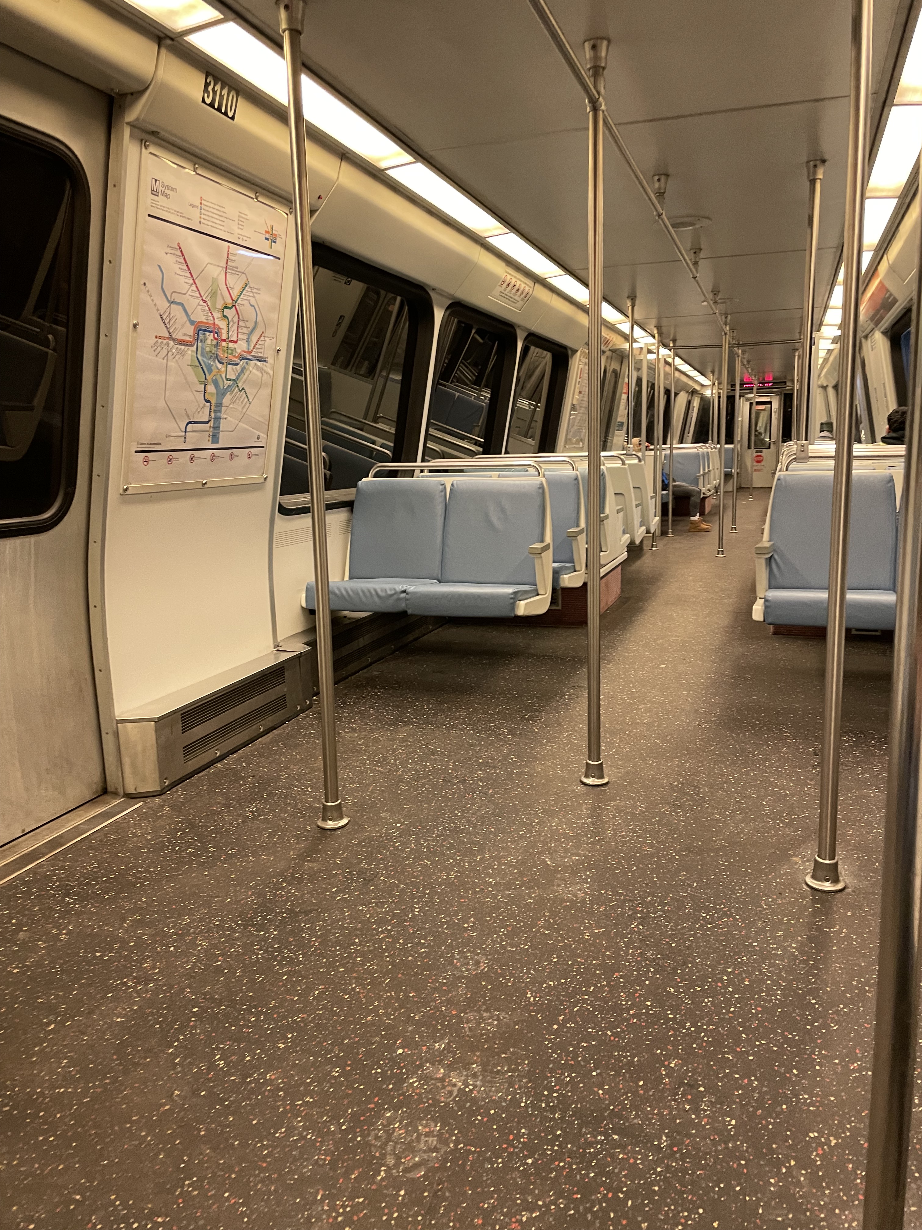
7. Shot From Above
I’ve been in D.C. for almost 2 whole years and Metro stations are still such interesting places for me. For that reason, I was compelled to capture this photo that emphasizes the “tunnel” element at Metro stations. I was able to capture this type of image only because I took a shot from above.
When taking a shot from above, you’re able to achieve a composition that shows the “bigger picture” of a particular scene.
8. Color Combinations
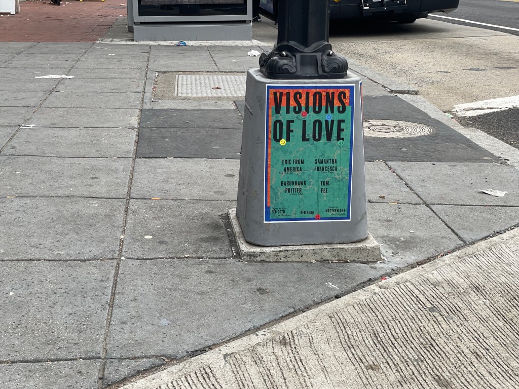
One thing that I love about D.C. is that there’s creative art in the form of posters, murals and flyers everywhere on the streets. What first captivated me in this particular shot was the text “Visions of Love.” It’s February—to me, this month is all about love (yes that was a bell hooks reference)— and this poster reinforces this reoccurring theme that I’ve been seeing all month.
When I took another look at the poster I realized that the color combination was also very intentional.Certain color combinations— in this case the blue, red and green— complement each other well and can be very visually striking.
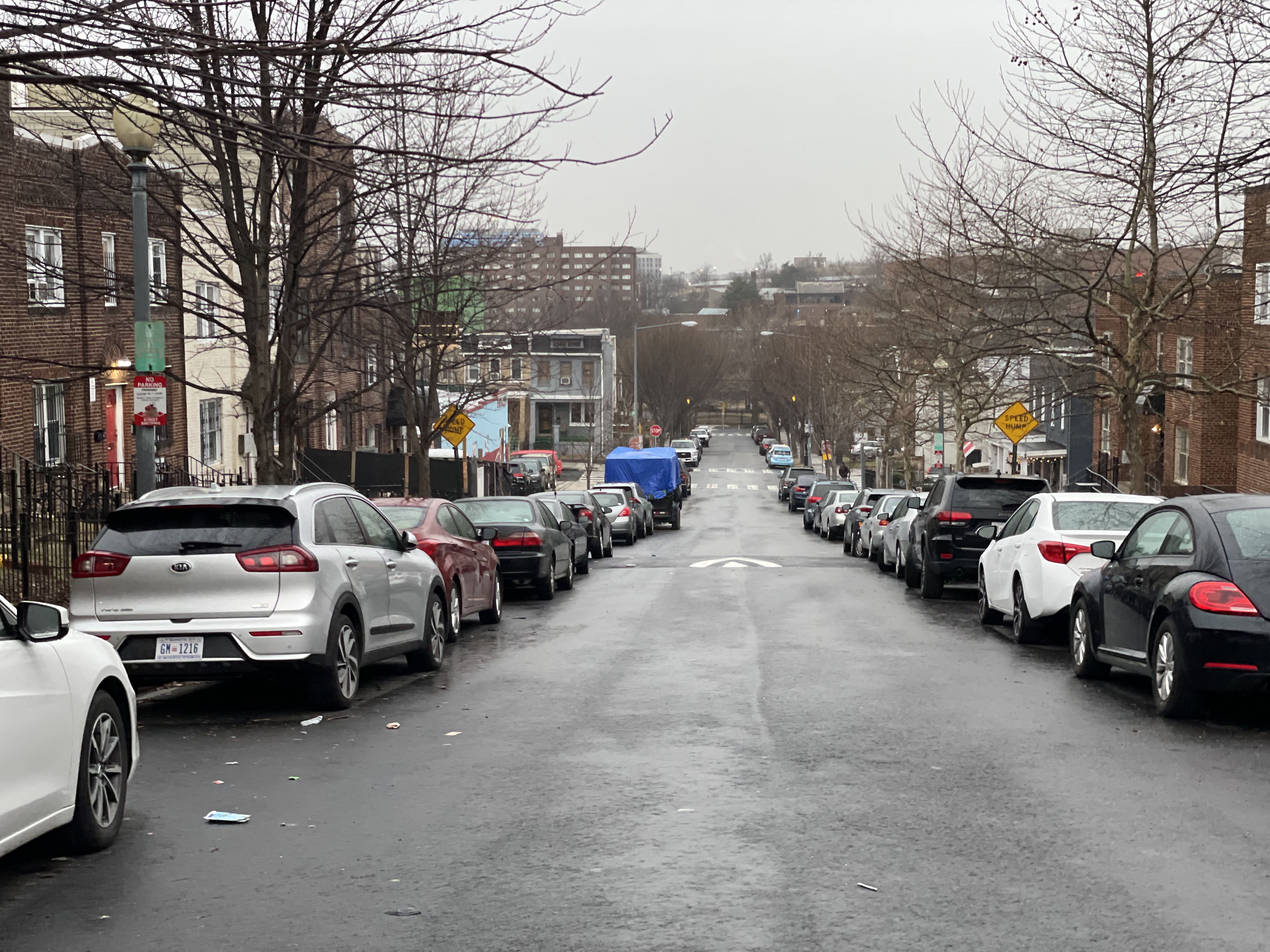
9. Rule of Space
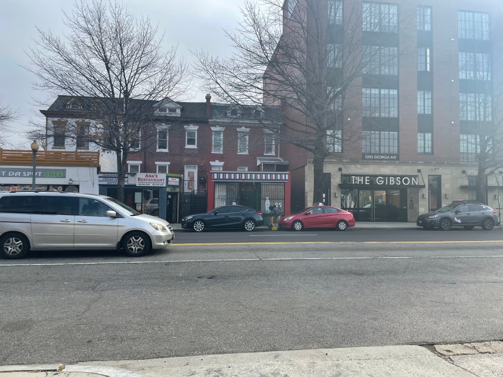
Since many of the images in this collection are a reflection of what I see during my walks to campus, I had to include a shot that acknowledges the ongoing and constant traffic in the city. In this photo you can see that the van was actively moving from left to right. In this regard, the rule of space relates to the direction the van is facing or moving towards.
I intentionally left more space in the frame in front of the van than behind it. This implies that there is space in the frame for the car to move into—as it was doing.
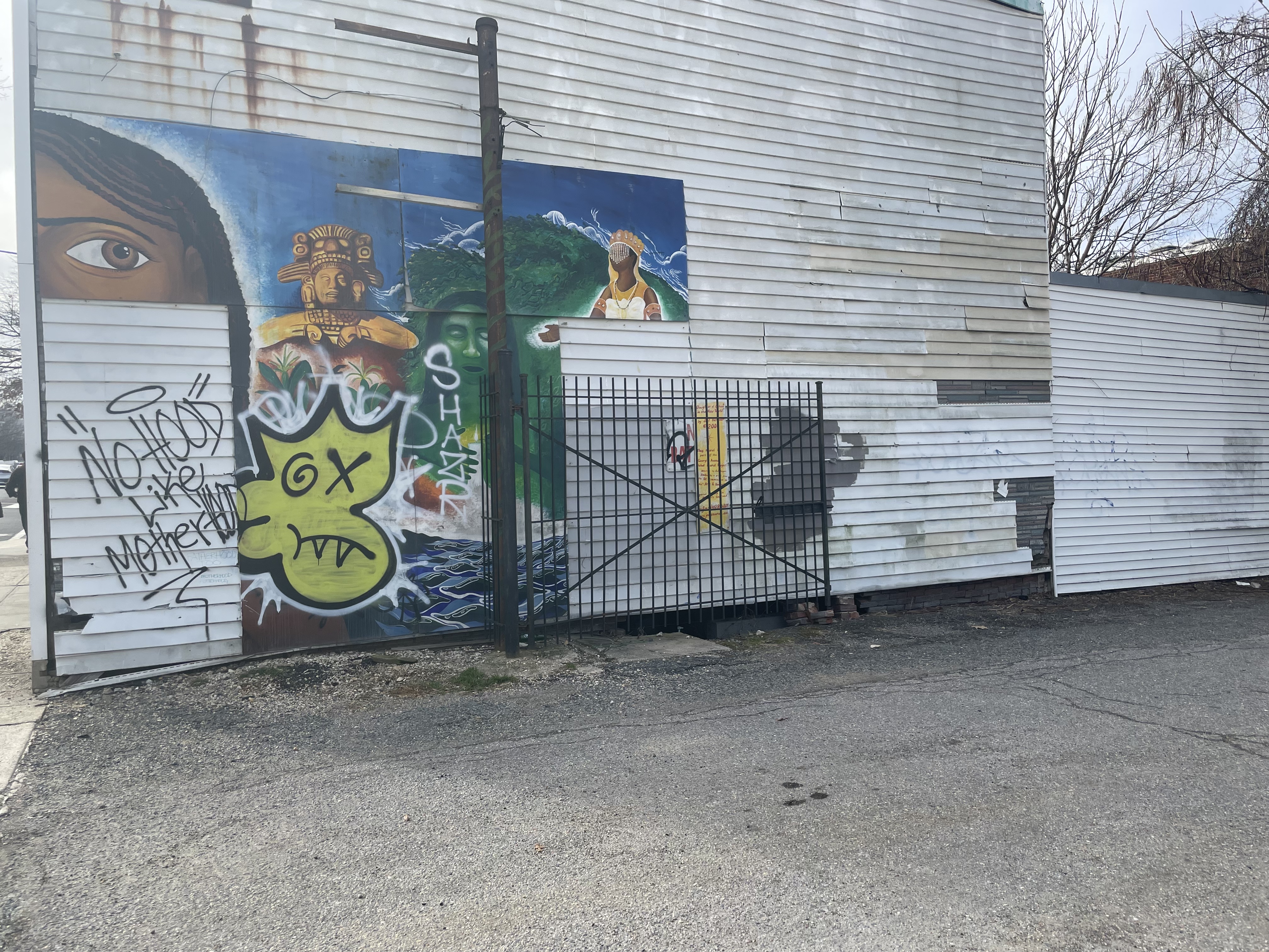
10. Juxtaposition
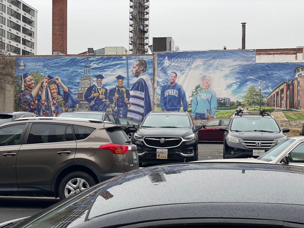
Juxtaposition is a tool I use when I write, and to learn how to use it as a compositional tool in photography strengths my visual journalism skills. To elaborate, juxtaposition refers to the “inclusion of two or more elements in a scene that can either contrast with each other or complement each other.”
With the conclusion of my day, I stopped and took a photo of this Howard mural. It’s eyeopening because if I never would’ve took the time today to slow down, I would have never realized it was there. The bright, lively mural which symbolizes Black excellence juxtaposes with the gloomy aura of the day, as well as, the gray and black cars in the foreground.
~~~~~~~~~~~~~~~~~~~~~~~~~~~~~~~~~~~~~~~~~~~~~~~~~~~~~~~~~~~~~~~~~~~~~~~~~~~~~
Here are a few other photos that I find pleasing and enjoyed capturing, but didn’t make the collection: